
Icons are small designs with a high functional impact. In design, this means you can condense a large quantity of information into its minimal form of expression. In other disciplines, however, icons have a different meaning.
With this in mind, graphic designer and icon enthusiast Hermes Mazali (@hmazali), shares some of those meanings with the Domestika community and gives us some tips to recognize an icon and distinguish it from a pictogram.
What is an icon?
An icon is a symbol that maintains a likeness with the object it represents. The word originates from the Greek eikon, which means ‘image’ and ‘clue.’ Generally, icons are used to communicate information without the need for words.
They are symbols with a high degree of meaning, and they are easy to decode, yet sometimes they need an anchor for better interpretation. Icons start from a concept and a style of their own and communicate a message or a function. They are characterized by relevant visual treatment, their graphic freedom, and their color palette.
Icons hold an essential balance of function, synthesis, and aesthetics to create a language that everybody can understand regardless of language, race, or age. The key is to hold a great deal of information in something minimal that can immediately deliver the message.

What are the main applications of icons?
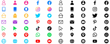
Because they are a powerful tool for visual communication, they can be used in various systems and media: in building signage, museums, airports, and many other corporate applications. They are also applied in the media and infographics, in user interface design, in mobile devices, and for using the internet.
The primary use of icons happens in the digital world and multimedia design.
Now that we know what an icon is and before we can start designing one, we must first understand what distinguishes icons from pictograms.
What are the differences between icons and pictograms?
The main difference is that an icon has greater artistic freedom. A pictogram schematically represents symbols and objects, without detail. One could say that it is the visual representation of a particular object with a high degree of abstraction.
The constraints of a pictogram are more significant than those of an icon because its meaning should always be clear and should be recognized by any culture, language, country, or faith. A pictogram must be extremely synthesized, reduced to its most basic expression.
Many pictograms tend to be used on warning and protective signs. They are more objective and formal, and their style is limited and strict. A key to identify them is that they appear as silhouettes. Pictograms are more formal, and icons, aesthetically speaking, are more fun in communicating a message or a concept.

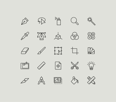
Essentials for a good icon design
Technology has advanced, but the icons still remain as essential as they were from the beginning. The only thing that has changed is the interface.
Look at icons as your brand ambassador. Unfortunately, many still treat them as an afterthought, and some don’t even think about them at all. If you are trying to sell your idea, you will need cohesive-looking iconography. Here are the fundamental principles of effective icon design that you should be aware of.
Basic forms
When you start designing an icon, the first thing you will do is establish your icon’s form or basic shape to ensure a solid foundation. The basic shapes are circles, squares, ellipses, triangles, and other geometric shapes.

The different shapes send different messages, so you need to ensure that you are not miscommunicating with your audience by using the wrong shape.
- Circles – A circle symbolizes nature, communication, relationship, and community. Since the circle represents completion, it is easy to correlate them with wholeness, information flow, and health. That being said, it is logical that the desktop application for Google Chrome or an icon for social media or some other communication mobile app icon is designed in a circle shape.
- Squares – Squares are symbols of stability, strength, and safety. Square shapes can be associated with balance, loyalty, dependability, and formality. Square shapes suggest order and good organization. They are used to represent building structures, grids, and tables, for example. Square shapes are used when designing interfaces for email icons, for instance.
- Triangles – A triangle is a shape that represents power, action, movement, and science, emphasizing the importance. You have seen that most signposts and icons that signalize directions are triangle-shaped. An excellent example of a triangle in icon design is YouTube or Google drive. Or warning notifications and forwarding actions on smartphones.
Try not to use many freeform designs because they might not appear professional enough. Geometric shapes have more influence and help you create a branded look that you will be recognized for.
Uniformity
Designers usually create a set of icons and rarely just one icon. They represent different subjects and actions, but they are related through visual appeal by having the same theme and aesthetics.
Each icon functions separately, but even if they are radically different, they need to communicate to your audience that they are associated with one another.
Use colors, shades, perspectives, and shapes to achieve this. If you decide to use only the front view when designing an icon, the whole set should be designed from the same perspective.

Aesthetic unity refers to shared elements within a single icon or set, like rounded/square corners, specific corner sizes, consistent line weights, style (flat, line, filled line, or glyph), and color palette. It visually ties a set together as a cohesive whole.
For example, Kem’s dog icons share elements like 2-pixel rounded corners, 2-pixel-thick strokes around faces, and heart-shaped noses.
Also, you must know how to frame the icons properly to achieve a balanced composition. Every icon should consist of visual elements (positive space) and blank parts surrounding the visual elements (negative space).
Simplicity
An icon must be readable and compelling no matter the size they are presented. You should always design the icon in the size that it will be used in, however, sometimes that is not possible, and you need to make your design flexible.
You need to ensure that the design is not changed when the icon is resized a few pixels wider or in a large format. The trick is to start your process in a small vector so that if your elements are readable in smaller sizes, they will be clear in every other size.

How to design an icon/icon set?
Always use a grid
To create a visually compelling icon style, the design must be precise and readable. Even the smallest of details and errors can ruin your hard work. When working with multiple lines and shapes, you need to leave enough space between them; that is why you need to use pixel grids to arrange and balance all the lines and shapes.
You can use:
- Square grids – These grids help simplify geometric forms and handle 90-degree angles.
- Dot grids – Use this grid to provide structure and help create a visually coherent design.
- Thirty-degree angle grids – These grids are used when creating triangles and irregularly shaped icons to ensure 3D quality.

Alignment is essential for clarity and balance. Using grids will help you make fine adjustments and create an optical illusion. Your design must be as neat as possible so the symbol on the icon can dominate and command attention and provide the best user experience.
Start with geometric shapes
Using geometric shapes for icon creation allows you to draw quicker than drawing everything yourself. But more importantly, icons come out to be more precise and smooth when made with geometric shapes.
For example, it is very easy to use the curvature of a circle than to draw a perfect circle using the pen tool.
Here’s a YouTube video by idedobe on how to design a bell icon on a 100pxX100px grid, using a circle and two rectangles.

In Adobe Illustrator, you can simply tug the corners and pull them outwards to create the hollow base of the bell. Prefer 45-degree angles or multiples thereof for crisp results. Breaking this rule is acceptable in halves (22.5 degrees) or multiples of 15 degrees, depending on the design.

Use shape tools and precise numbers to create curves whenever possible. Hand-drawing may result in less-than-perfect curves, impacting the overall quality.
Consider common rounded-corner values, like a 40-pixel radius for this design, to balance visibility and maintain the design’s personality. Rounded corners are an aesthetic choice that influences the overall set.

Align elements to the pixel grid for pixel-perfect results, especially at smaller sizes. This ensures crisp edges, particularly on straight lines and precise angles.

Keep it simple. Don’t overwhelm your design by using too many details. Remember, icons are designed in small formats, and the goal is to use the bare minimum to make the statement. Including too many elements will make your icon too complicated and unreadable.
Reductive style is always the safe bet. It’s better to keep your icons short and sweet than risk making them unreadable and confusing by using too many visual elements
Use the correct line weight
In most icon designs, you need two pre-determined line weights, in some cases, you might even need three. Choose your line weights before you start polishing your icons.
Established line weights help you maintain visual hierarchy and an icon set’s consistency. That’s why do not use more than three line weights, otherwise, it might mess up the cohesion.
For example, the benefit of 2- and 4-pixel line weights is that they are multiples of 2 and, therefore, easily scale up and down in even increments.

One tip that you must follow is always to avoid thin lines, especially in glyphs and flat icons.
Stay consistent with contrast, lighting, and colors
The idea is to incorporate your brand’s colors and pair them with the color that will create the perfect contrast and make your design grab attention at first glance. However, don’t make the mistake of using colors that clash with each other a lot; make the contrast subtle but effective.

If you decide to use shadows and play with lighting, you should use them correctly. If you use a light source in one direction, then stay true to that and apply that scheme on all other icons, or else you will compromise the integrated design.
Communicate your message clearly
Clarity is one of the most important guidelines for icon design. The message you want to convey via your icon must be crystal clear. Context is key in creating purposeful icons; without it, irrelevant details can lead to confusion.
Whether for mobile apps or system tray icons, understanding the context is essential for effective design.
Think about the purpose and establish a clear association between design and meaning. Outstanding icons can endure for years, transcending their original reference points, like the timeless “save” button resembling a floppy disc.
Make it unique and original
Every graphic designer wants to create high-quality icon packs that are memorable and simple enough to understand. Even if it looks cliche, use easy-to-understand visual elements but do not forget to add your own twist to it.
Many iconographers create custom icons and offer them for free. This allows them to test their designs when users download and use the icons and provide feedback. If you do this, too, you can use this feedback to create a more unique and original variant of the icons and sell them as a premium icon pack.
Conclusion
We have shared the essentials of what goes into making a good icon and the tips you should follow when designing an icon. Choose a basic form and keep designing till you create a premium-quality icon. Just remember, keep your icons internally consistent.
If you are designing an icon set, use shared elements, consistent line weights, and pre-determined colors to create aesthetic unity. But when doing all this, do not forget to infuse your creative vision into the icon design.